Brand guidelines
Logo usage
Kirshner Elkin Properties (KEP) Brand Guidelines include the name, logo, and any word, phrase, or image. Please don't modify the marks or use them in a confusing way, including suggesting sponsorship or endorsement by Kirshner Elkin Properties, or in a way that confuses Kirshner Elkin Properties with another brand (including your own). If you are unsure, please feel free to contact us!
VERTICAL (MAIN)

WORDMARK

ICON

HORIZONTAL (SECONDARY)

COLOR PALETTE
A color palette is a set of colors used to represent your brand consistently across all visual assets. It should be chosen based on your brand's personality, values, and target audience. Consider factors like emotional associations and color suitability, and document it in your brand guidelines for consistency.
BLACK
#000000
RGB(0,0,0)
CMYK(0,0,0,100)
PEBBLE
#9D958A
RGB(157,149,138)
CMYK(0,5,12,38)
MATCHA
#B7B79F
RGB(183,183,159)
CMYK(0,0,13,28)
FRENCH BLUE
#9EB7C3
RGB(158,183,195)
CMYK(19,6,0,24)
SAND
#D8BF9F
RGB(216,191,159)
CMYK(0,12,26,15)
BLUSH
#E5D4C6
RGB(229,212,198)
CMYK(0,7,14,10)
CEMENT
#EEEBE5
RGB(238,235,229)
CMYK(0,1,4,7)
WHITE
#FFFFFF
RGB(255,255,255)
CMYK(0,0,0,0)
Social media examples


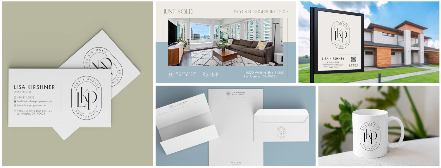
Print branding examples
